UI/UX Case study · November 2025

A doctor appointment app for the whole family.
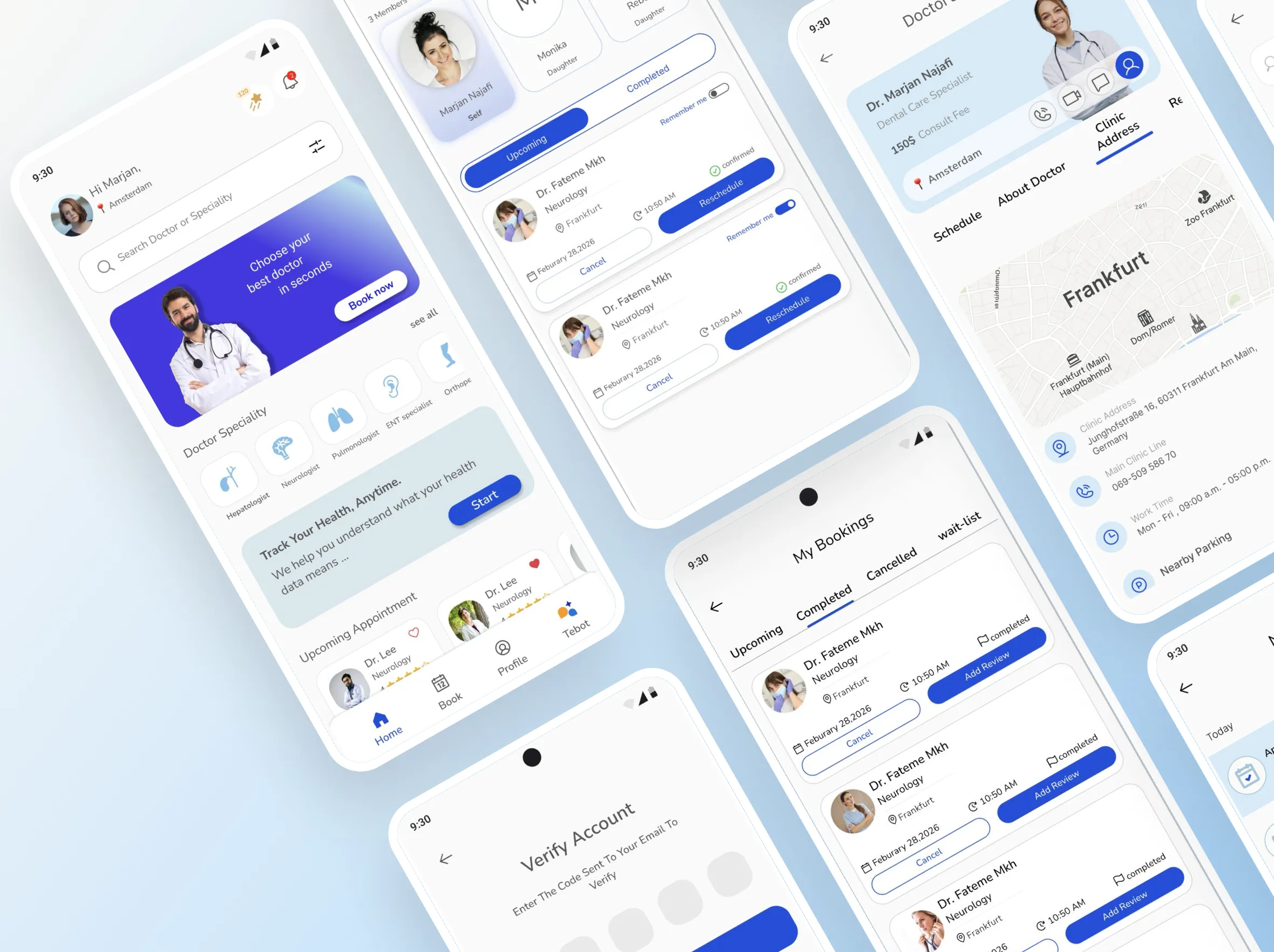
Project overview
Tebeto is more than a booking tool. It makes healthcare simpler with family member management, smart waiting lists, a helpful chatbot for doctor guidance, gamification rewards and digital document uploads — a smoother experience for both patients and doctors.
Target audiences
- Age 30–55
- Patients with specific needs
- Users familiar with online platforms
- Families managing multiple profiles
Business goals
- Gain market share in online medical bookings
- Earn revenue through commission and service partnerships
Problem & solution
Five frustrations kept coming up in research. Each one became a feature.
- Problem
Managing appointments for the whole family is difficult
SolutionOne platform for all family appointments
- Problem
Long queues and limited availability cause delays
SolutionReal-time availability and a waiting list system
- Problem
Users struggle to choose the right doctor confidently
SolutionChatbot guidance to choose the right doctor
- Problem
Paper documents are lost or forgotten during visits
SolutionUpload and store medical documents digitally
- Problem
No engagement leads to missed reviews and appointments
SolutionGamification to boost engagement and attendance
Design process
We applied a User-Centered Design (UCD) approach to prioritise the user and focus on their needs throughout every phase of the design process.
Discover
- User interview
- Survey
- Competitor analysis
Design
- Site map
- Interaction flow
- Wireframes
- UI design
- Prototype
Test
- Usability test
Timeline
Discover
By exploring behaviours and frustrations, we identified the core gaps in the existing appointment booking process, which later guided the feature direction for Tebeto.
Survey
To better understand patient behaviours and booking challenges, we ran an online survey using Porsline as our distribution and data-collection tool. It helped us identify the key pain points.
1Recent in-person visit experience
2Criteria for selecting a doctor
3Online booking challenges
4Appointment & document reminders
Competitor analysis
Benchmark
We analysed leading competitors including Paziresh24, Doctoreto and DrDr to identify key features, gaps and opportunities in the online medical booking market. These insights helped define how Tebeto can deliver a more seamless and comprehensive appointment experience.
| Feature | Paziresh24 | Doctoreto |
|---|---|---|
| Online appointment booking | Yes | Yes |
| Online consultation (audio/video/text) | Yes | Yes |
| Specialty-based filtering | Yes | Yes |
| Doctor profile | Yes | Yes |
| Doctor reviews & ratings | Yes | Yes |
| Clinic address / map view | Yes | Yes |
| First available appointment times | No | Yes |
| Booking confirmation | Yes | Yes |
| Appointment reminders | Yes | Yes |
| Rescheduling / cancelling options | Yes | Yes |
| Booking for family members | Yes | Yes |
| Estimated wait time | No | Yes |
| Bot assistance | Yes | No |
User persona
We created a persona based on our research insights, highlighting her lifestyle and personality, goals and motivations, frustrations and needs.
Goals & motivations
- Book doctor appointments for herself and her family quickly, easily and reliably.
- Avoid wasting time in clinic queues.
- Receive accurate reminders so no appointment is forgotten.
- Save and access visit history whenever needed.
Needs
- Reliable, instant confirmations.
- Ability to manage the entire family under one account.
- Easy access to appointment history.
Background & lifestyle
- Has limited time due to balancing full-time work and family duties.
- Prefers doing essential tasks online to avoid unnecessary in-person delays.
- Highly values her family's health; frequently needs to schedule appointments for her children and husband.
- Has had bad experiences with online systems (failed reservations, missing confirmation messages), making her less trusting of digital platforms.
Pain points & challenges
- Confirmation SMS sometimes doesn't arrive, causing stress and uncertainty.
- Registration and login processes in some apps are long and confusing.
- Booking separate appointments for each child takes a lot of time.
- Often unsure whether an online reservation was actually completed, leading to unnecessary in-person visits.
- Frequently forgets appointments due to ineffective reminder systems.
Design
User flow
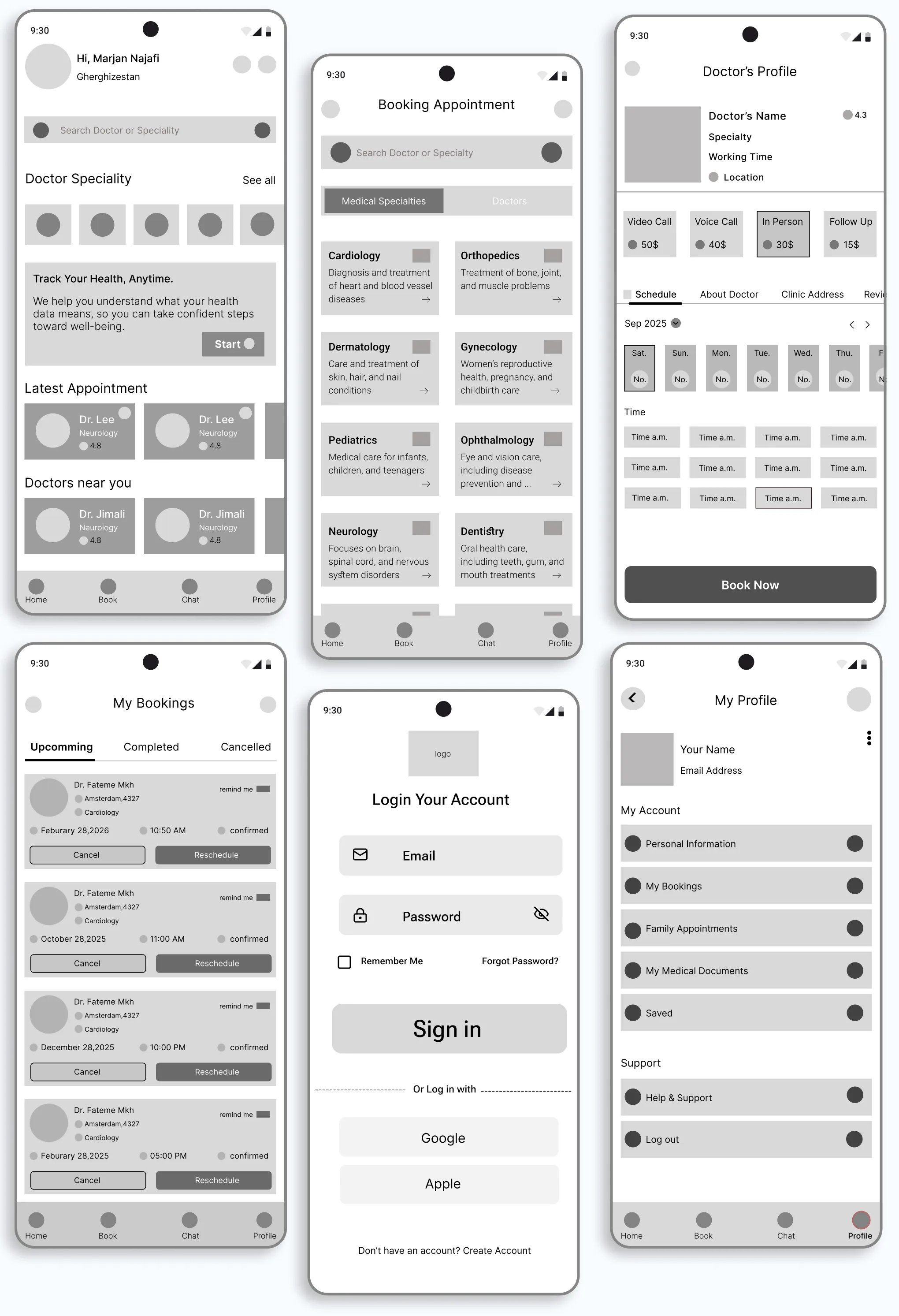
Low-fi wireframes
Early conceptual sketches outlining the app's structure, layout and user flow to validate ideas before high-fidelity design.
Hi-fi mockups
The final interface: a calm blue palette, generous touch targets and one consistent component language across every flow.
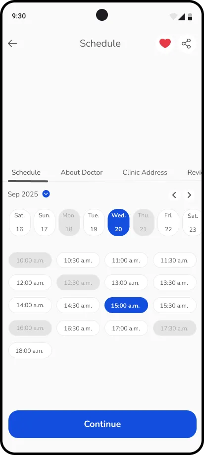
01Schedule & booking 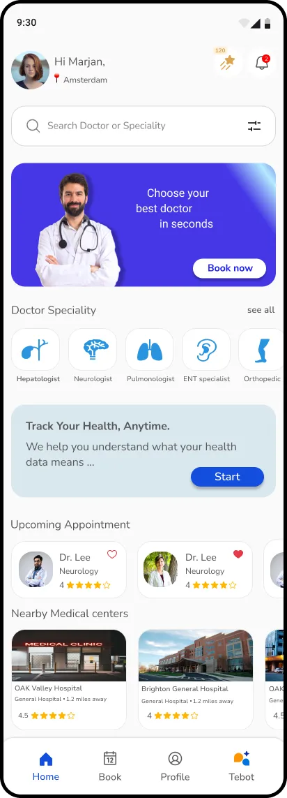
02Home 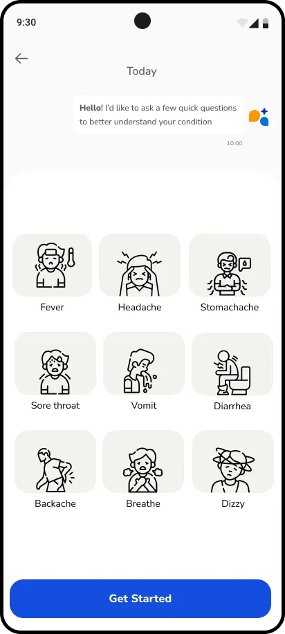
03Tebot symptom check
What makes it different
Family profiles
Manage every family member under one account and book for each of them without starting over.
Smart waiting list
Real-time availability plus a waiting list, so limited slots no longer mean long queues and delays.
Tebot, the chatbot
Guided questions about symptoms help users choose the right doctor with confidence.
Digital documents
Upload and store medical documents in the app, so nothing is lost or forgotten at the visit.
Gamification
Points and rewards encourage reviews and showing up — boosting engagement and attendance.
Style guide
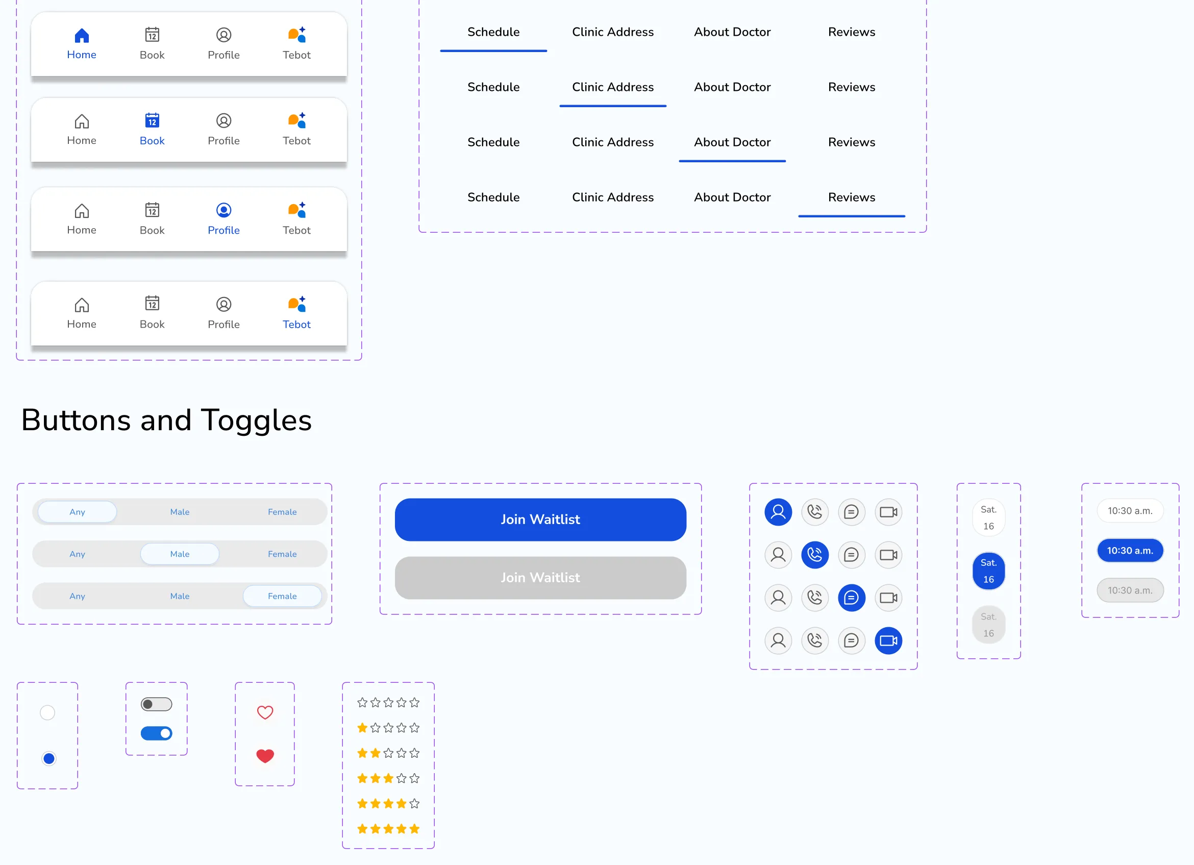
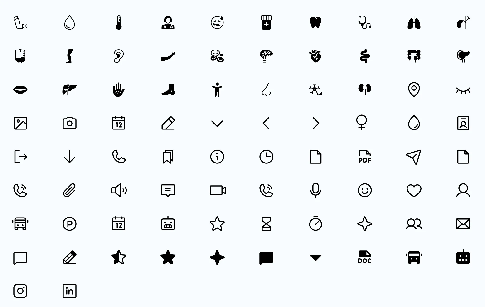
A compact system that keeps every screen consistent: four colours, one type scale, a five-column grid and a small set of reusable components.
Colour palette
- Primary
- Secondary
- Text colour
- Success
Typography
- Heading 120 · Regular
- Heading 216 · Regular
- Heading 316 · Semibold
- Heading 416 · Bold
- Body13 · Medium
- Body12 · Regular
Layout grid
- 5 columns
- Margin 16 px
- Gutter 8 px
Buttons & inputs
- Primary CTA
- 380 × 56 px · radius 20 px · text 16 px
- Secondary button
- 186 × 48–56 px · radius 8–10 px
- Input
- 380 × 56 px · radius 8 px
- Card
- radius 12–16 px
Outcome
By centering on user needs — clarity, control and connection — the Tebeto design created a more efficient and empathetic healthcare journey. The solution demonstrates how intentional design can alleviate patient anxiety, save time and foster trust, ultimately making essential care more accessible for everyone.
Want to see it move?
Explore every screen and interaction in the Figma file.